ABOUT THE PROJECTWhisky.fr is a key player in the French e-commerce world of whisky and spirits. My role as UI designer was to lead the redesign of key site pages with a focus on clarity, consistency, and a more refined user experience.
I redesigned the homepage, product pages, and checkout to feel more modern and user-friendly, while also improving mobile navigation and SEO performance. I also crafted custom icons and visual elements to support the updated brand direction.
This redesign delivers a sleek, modern interface and a seamless user experience, revitalizing the brand while staying true to its roots.
ROLEUI/UX Designer, Web designer
CLIENTLa Maison Du Whisky, E-commerce


Menu Header
Designing the menu header quickly became a challenge: how to showcase the incredible diversity of LA MAISON DU WHISKY (whiskies, but also rum, sake, gin, and more) without overwhelming the user? Our mission was to create an intuitive entry point that feels effortless from the very first click. After experimenting with more than ten different approaches, we finally shaped a solution that balances clarity, accessibility, and character.
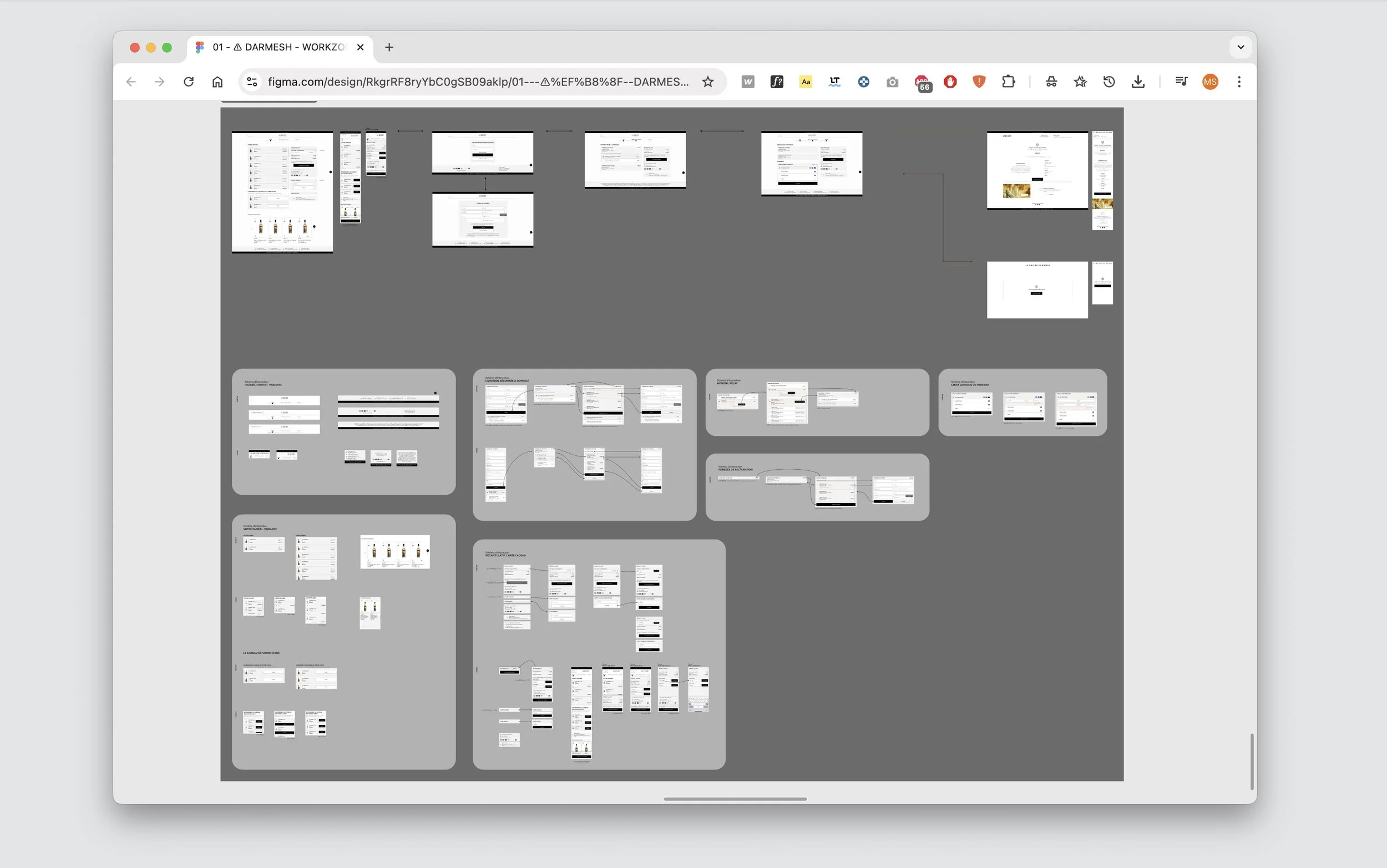
Responsive
Designing for responsiveness was a key part of the process. From desktop to mobile, every breakpoint needed to feel natural and fluid. I carefully considered how visuals and frames would adapt across devices, creating components that seamlessly adjust to each screen. To keep the experience consistent, I also limited the number of frame variations, ensuring clarity and harmony no matter the format.
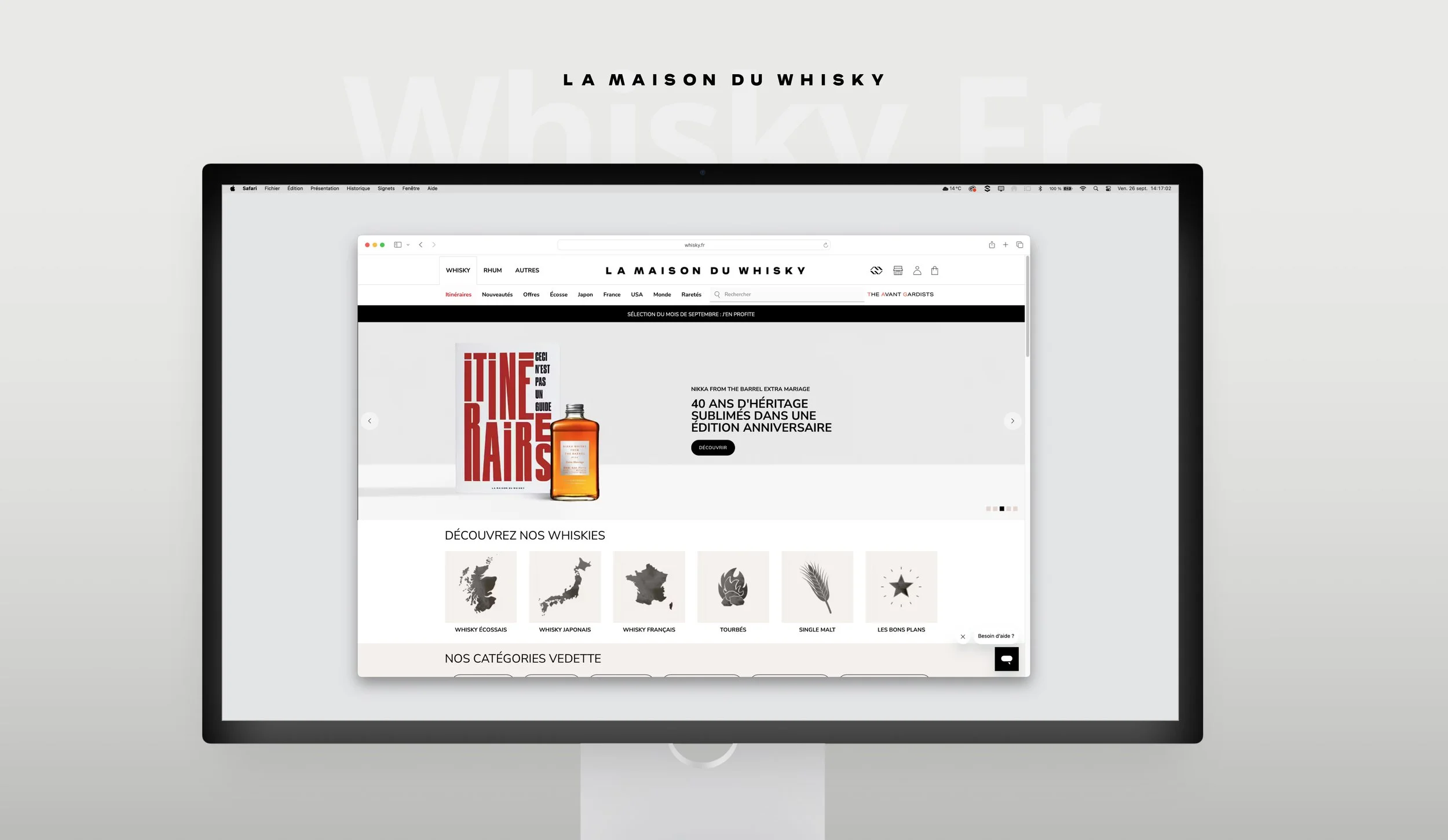
Homepage
The homepage was designed as a gateway : inviting, immersive, and informative. We wanted it to open the door to all the different services: retail, news, and much more, while also being optimized for SEO to remain easily accessible. To set the tone, we crafted an immersive hero banner highlighting the latest products, supported by a few sliders and smaller banners. Together, they create a dynamic first impression that both informs and engages.
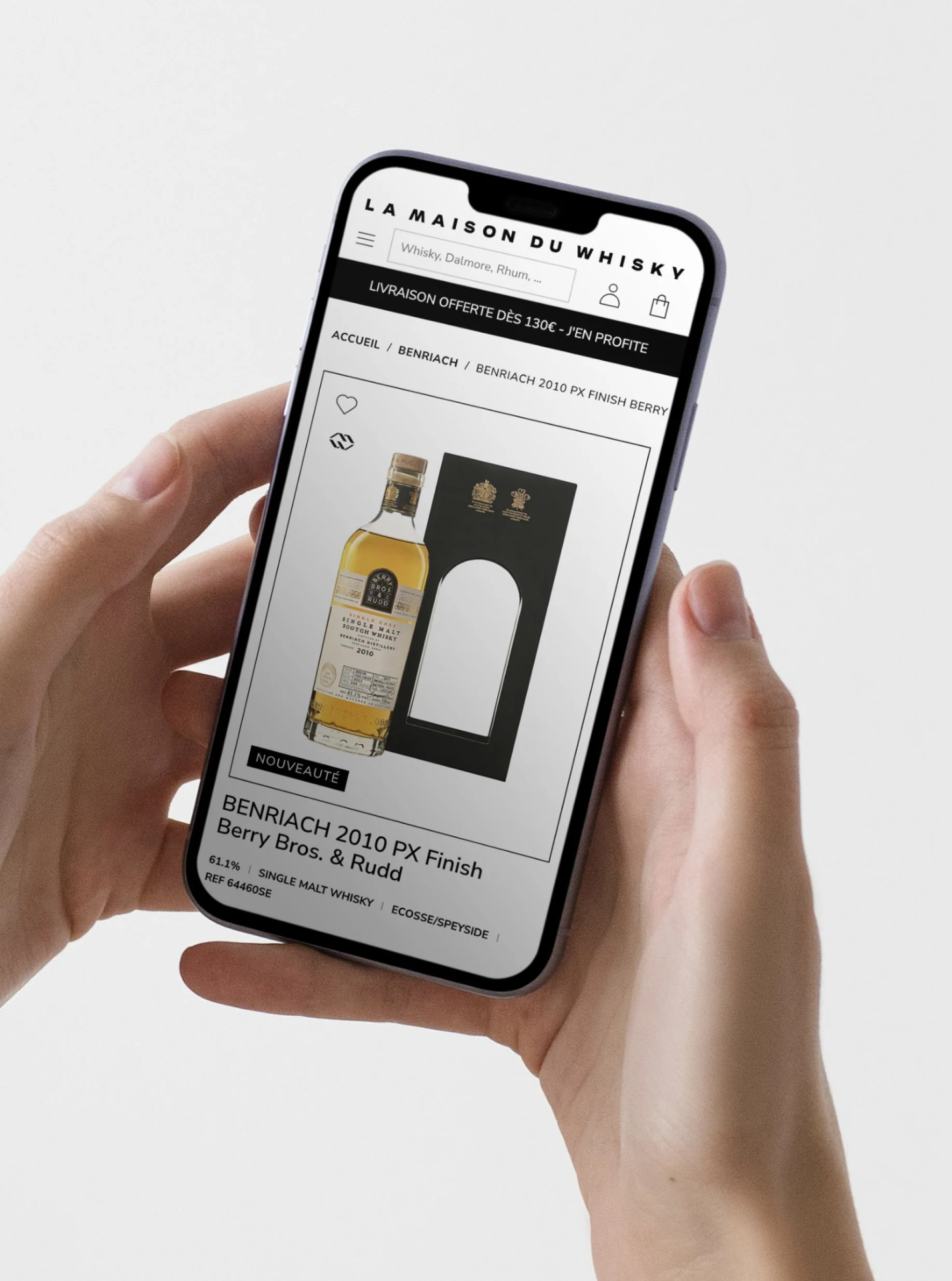
Product Page
For the product page, our goal was simplicity with a premium feel. We wanted users to truly spend time here, so every element was carefully considered: only the essentials, presented with clarity. Key actions are highlighted with a strong call-to-action button, making sure nothing important is overlooked.
Beyond the layout itself, I also crafted the visual language of the site. I designed a full set of custom icons and built a flexible brand system in Figma, making it easy to update or expand whenever needed. This not only ensures visual consistency, but also streamlines future design work.
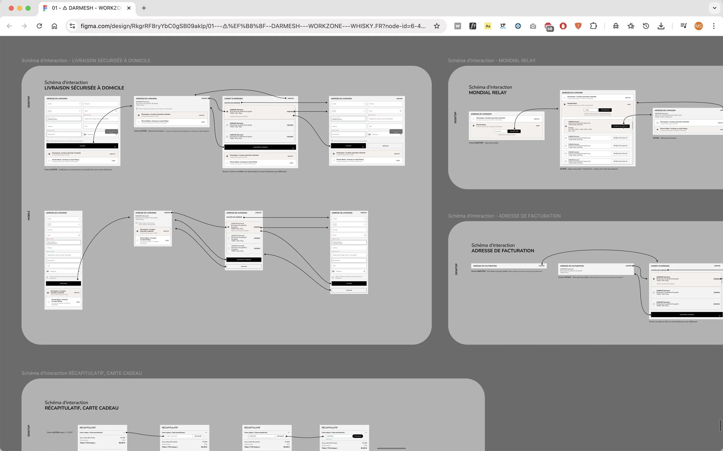
Cart
The cart was designed as a separate feature from whisky.fr, but it was essential to preserve the same look and feel for consistency. While the overall user journey remained similar to the old flow, the visual design required a complete refresh.
Redesigning the steps wasn’t without challenges, we encountered several usability issues as we iterated. To overcome them, we created detailed wireframes, studied different scenarios, and carefully mapped the journey on both mobile and desktop. Finally, we tested the experience with real users, refining each step until the checkout flow felt smooth, intuitive, and trustworthy.